Thursday 6 February 2014
Wednesday 15 January 2014
Self Directed
Proposal
[insert here when completed]
The Art of Glitch?


[insert here when completed]
The Art of Glitch?
What is a Glitch?
A glitch is a short-lived fault in a system. It is often used to describe a transient fault that corrects its self an, and is therefore diffucult to troubleshoot. The term is particularly common in the computing and electronic industries, and in circuit bending, as well as among players of video games, although it is applied to all types of systems including human organizations and nature. The term derives from the German glitschig meaning 'slippery', possibly entering English through the Yiddish term glitsh.
What is Glitch Art?
Glitch Art is the aestheticization of digital or analog erros, such as artificats and other "bugs", but either corrupting digital code/data or by physically manipulating electronic devices (for example by circuit bending).
Can Glitches be seen as a good thing?
EARLY WORK EXAMPLES


EARLY WORK EXAMPLES
Here I have chosen to glitch and recreate images of my niece. I decided to use these particular images as they show a different angles of her and my work is looking into faded memories and faces. As she is young and still growing I decided to use her for an early example and experimentation. When she is older she will not really remember these images been taken of her, so the glitches represent memories being some what forgotten over the years. I think these images are very effective and I will be experimenting further with these.
Here is another example of a glitch image taken of my niece.
Tuesday 14 January 2014

Tuesday 31 December 2013
PHOTOGRAPHY
Project Five
The Portrait and the Self Portrait


MY WORK
Self Portrait

.jpeg)
MY WORK
The Portrait


The Portrait and the Self Portrait
For this project we were asked to look into Portraiture and Self Portraits. Portraiture when commissioned from an artist is expected to flatter the subject and show them as they wish to be seen by others. They have been around for a long time and we know some of them for example, Da Vinci's Mona Lisa and Vermeer's Girl with a Pear Earring. Self Portraits by artists as expression has also been around for a while. The artist always has themselves as the subject and in both they are recording detail, although some may not be a true honest image.
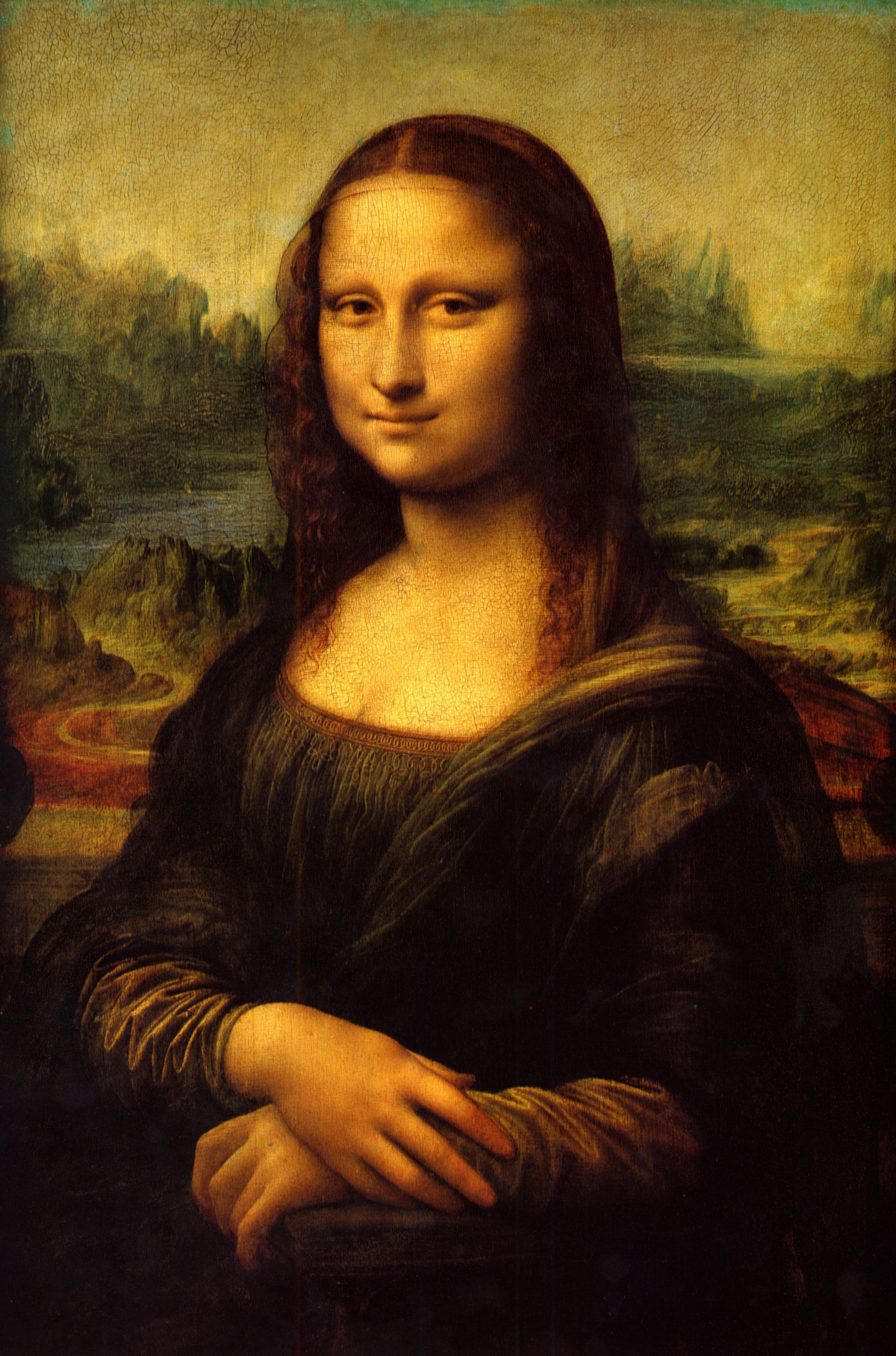
The Mona Lisa is the most famous painting anyone will ever come across. Its been done behind an imaginary background, which is the again the concept of wanting people to see her this way. The form and structure of the portrait is very symmetrical and even, which makes it even better. There the same kind of tone across the whole image that's also interesting. Overall I think its a good portrait of showing someone.
_-_The_Girl_With_The_Pearl_Earring_(1665).jpg)
LEONARDO DA VINCI
Painting Bio:-
The Mona Lisa is a half-length portrait of a woman by the Italian artist Leonardo Da Vinci, which has been acclaimed as 'the best known, the most visited, the most written about, the most sung about, the most parodied work of the art in the world'
The Mona Lisa is the most famous painting anyone will ever come across. Its been done behind an imaginary background, which is the again the concept of wanting people to see her this way. The form and structure of the portrait is very symmetrical and even, which makes it even better. There the same kind of tone across the whole image that's also interesting. Overall I think its a good portrait of showing someone.
JOHANNES VERMEER
Painting Bio:-
The painting Girl with a Pearl Earring is one of Dutch painter Johannes Vermeer's master works and as the name implies, uses a pear earring for a focal point. It is now the collection of the Mauritshius gallery in The Hague, but in 2013 has toured the United States with other works.
I like how simple and true this portrait is. Its very simple but has an effect on its viewers. Although its an fictional character that he got someone to dress up as, its still a good Portrait that you could say is how he wanted people to see her, instead of how she wants people to see her. I like the bold colours and the way her eyes seem like there glaring. It really draws your attention to the photo.


I like how simple and true this portrait is. Its very simple but has an effect on its viewers. Although its an fictional character that he got someone to dress up as, its still a good Portrait that you could say is how he wanted people to see her, instead of how she wants people to see her. I like the bold colours and the way her eyes seem like there glaring. It really draws your attention to the photo.
REMBRANDT
Painting's Bio:-
The dozens of self-portraits by Rembrandt were an important part of his oeuvre as a painter. He Created nearly one hundred self-portraits during his lifetime including approximately fifty paintings, thirty-two etchings ans even drawings. The self-portraits create a visual diary of the artist over a span of forty.
Most of Rembrandt's paintings seem dark and not very well lit when looking at them, which makes me think that this is how he wanted people to see him. With an unclear shot of his whole face. This adds character to his series of self portraits which then create a narrative, almost like a visual diary of the artist as said above.


SELFIE
A selfie is a type of self-portrait photography, usually taken with a hand held digital camera or camera phone, most popular the iPhone, with its handy front camera. Selfies are often associated with social networking. In Korea the word selca, short for 'self camera' means photos taken of oneself. They are often casual and are typically taken either with a camera held at arm's length or in a mirror, and including either only the photographer or the photographer and as many people as can be in focus. Selfies that are taken and involve multiple people are known as 'group selfies'. The term 'selfie' originated in Australia in 2002 on an internet forum.
In August 2013, the Guardian produced a film series titled: Thinkfluencer exploring selfie exposure in the UK. Denoting a pathological condition: Selfieism.
MY EXAMPLE SEFIES
MY WORK
Self Portrait
'Honest' Self Portrait
I was asked to take an self portrait showing what I thought shows me in a true honest way. I feel that this images does that as when taking the image, I was in my everyday form and changed nothing different about me for the image. There is an exposure of light used and that was to enhance the image all over and give it a different effect, almost like an filter. Although I have done this I still feel as if the image is still me in a very honest way and a way in which I don't mind others seeing me. I decided to place me near the bottom right of the image so that there is almost an even ratio to me and the background which makes you focus on both. The background glow allows me, the subject to stand out more in this image.
How I want to be seen Portrait
For the second part of this project I was asked to take a self portrait that shows me in a way in which I would like others to see me. For this one I decided to change the lighting dramatically. I wanted to create a mood/emotion for the viewer and I think I have done well to achieve that. To create this image I had all the lights off and one spot light on just below me to get this effect. I wanted it to be very dark and eerie like. I tried to pull an expression-less face but I think I have shown some sort of emotion which suggests that I'm angry or some what mischievous. Once taking the photograph I edited further to allow me to get the image more darker to set a mood even more. I did originally want the whole background of the image completely blacked out, but I thought that was a bit cliché, so I decided to allow some light though in the back.
MY WORK
The Portrait
For this part of the project, I took a photograph of someone that I know and in an honest way. I asked the subject to be facing a side profile as I thought it would be an interesting way of showing an portrait. Also I used some lighting in this photograph and I wanted to create a slight shadow behind the subject, almost a silhouette. The subject is also not dressed in any way particular and has a normal facial expression which also shows the honesty in the image. I took the photo in black and white as I thought it went well with the character and personality of the subject. Also I think is very effective and still shows a lot of detail compared to colour images. I think that black and white images creates more of a mood rather then a coloured photo.
Here is an image of my subject and how I wanted him to be seen. This image is also linked to my self directed project. Firstly I took a photo of my subject quite close up and face forward. I wanted to get a clear shot of his face so that it could be later on be manipulated in the way I like. Then after I decided to use Photoshop to manipulate the image to show an 'Glitch' effect. I decided to do this because I wanted to show that mistakes can be interesting and all of us make mistakes of our own through life. I also just wanted to separate areas of his face so that the audience could concentrate on certain areas and get some sort of emotion from them. I wanted to show confusion and distortion.
Friday 20 December 2013
PHOTOGRAPHY
Project Four
Soundscape
For this project B, we were asked to look at a photograph and add a sound to it. For example something from your childhood or an photography will often evoke a memory. Also some artists use sound to compliment their artwork at times. Sound and vision are most important in how we see and interact with the world. It's difficult to re create a sound from a memory so its important to sometimes record these things. So instead of just simply recording a video, I am going to choose an photograph and re create it as a Soundscape.
JANET CARDIFF

Artist Bio:-
Janet Cardiff is a Canadian installation artist. She works in collaboration with her partner George Bures Miller. Janet first gained international recognition in the art world for her audio walks in 1995. Cardiff's installations and walking pieces are often mixed media and audio-based. She has been included in exhibitions such as: Nine Artists in the Nineties,San Francisco Museum of Modern Art, the Tate Modern Opening Exhibition as well as a project commissioned by Artangel in London. This project 'The Missing Voice (Case Study B' was commissioned in 1999 and continues to run. It is an audio tour that leaves from the Whitechapel Library, next to the Whitechapel tube stop and snakes its way through London's East End, weaving fictional narrative with descriptions about the actual landscape.
 |
| Forest (For a Thousand years..) 2012 CARDIFF & MILLER |
Materials: Audio Installation
Duration: 28 Minute Audio Loop
A remarkable thing about Janet Cardiff ans George Bures Miller's utterly captivating sound installation is how it blurs distinctions between site ans art. You enter a clearing in the forest, sit down on a wooden stump, and simply listen. Cardiff and Bures Miller's work incorporates the actual forest into an audio composition emitted from more than thirty speakers. Sometimes there is a near synchronicity of natural and meditates sounds, and its tough to discern what is live and what is recorded.
MY WORK

Here is the image I have decided to use for the project. I work at an Tesco Extra, in New Oscott, Birmingham. It is one of the biggest ans busiest stores in the area. When going to work I hear various different sounds and voice from babies crying to married couples talking, tills beeping, as well as my fellow colleges. When at home or away from work I block out everything about it including the noises I hear. When bringing up a memory from work, I rarely remember the noises going on around me. I thought It would be interesting to record as I was going in and getting ready for work as I would like to compare the different areas of work as some parts are quieter than others. Also to show the busyness of the store itself only through sound.
Friday 13 December 2013
PHOTOGRAPHY
Project Three
Stills and Movement
For this project we were asked to look into still images and putting them into a video as a sequence, narrative or other. When using more than one image in a sequence, it becomes a narrative. It can be traditional story telling or and abstract approach.
THOMAS DEMAND
Artist Bio:-
Thomas Demand is a German sculptor and photographer. He has been the subject of one-person exhibitions at the Musuem of Modern Art, New York and the Neue Nationalgalerie, Berlin and he has represented Germany at the Venice Biennale and the Bienal de Sao Paulo. Demand lives and works in Berlin.
JAMES COLEMAN
 |
| Seeing for Oneself (1987-8), film still |
Artist Bio:-
James Coleman is an Irish installation and video artist associated with slide-tape works: sequences of still images fading one into the other with synchronized sound. Often, social situations are depicted with a precision which, paradoxically, creates a narrative ambiguity.
AN INSTAGRAM SHORT FILM
Whilst doing some research, I came across this video by someone called Thomas Jullien that I found interesting. Instagram is a Photo sharing social networking app. Its an incredible source for all kinds of pictures. He states that he wanted to create structure out of chaos. The result is s crowd source short-film that shows the endless possibilities of social media. The video consists of 852 different images, from 852 different Instagram users. I love the idea and the concept behind this video.

MY WORK
I decided to use the sequence images I had from my previous project as I had a total of 96 frames which I thought was enough. Firstly I thought I would create an GIF image to show the narrative of my images rather than a video. I did this because I find it a much more simpler way of showing my images as they are, without any edits or transitions at the moment. I will continue to work on these images and eventually create a video from them.
Wednesday 4 December 2013
PHOTOGRAPHY
Project Two
Photography and Time
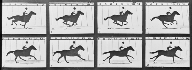
EADWEARD MUYBRIDGE

Artist Bio:-

JOHN COPLANS


Artist Bio:-

MY WORK

Photography and Time
When you look into Photography and Time, there's a lot of things that come to mind, for example a series of photos taken at one time or and photo that has been taken, that looks like it could of been taken years ago. Either way these images could tell a story and all have something to do with time and timing.
EADWEARD MUYBRIDGE
Artist Bio:-
Eadweard James Muybridge was an English photographer important for his pioneering work in photographic studies of motion, and early work in motion-picture projection. Muybridge's reputation as a photographer grew in the late 1800s.
Speculation raged for years over whether all four hooves of a running horse left the ground. The former Governor of California believed they did, but the motion was too fast for human eyes to detect. In 1872, Muybridge began experimenting with an array of 12 cameras photographing a galloping horse in a sequence of shots. Between 1878 and 1884, he perfected his method of horses in motion, proving that they do have all four hooves off the ground during their running stride. Whilst working at the University of Pennsylvania, he produced thousand of images of humans and animals in motion.
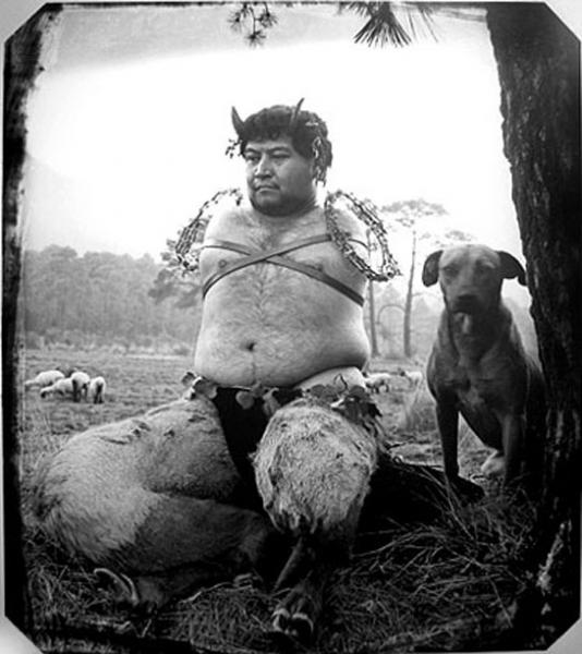
JOEL-PETER WITKIN
Artist Bio:-
Joel-Peter Witkin is an American photographer. His work often deals with such themes as death, corpses and sometimes dismembered portions thereof and various outsiders such as dwarves, transsexuals, hermaphrodites and physically deformed people. Witkin's complex tableaux often recall religious episodes or classical paintings. He says his family's difficulties also influenced his work. His favorite artist is Giotto. His photographic techniques draw on early Daguerreotypes and on the work of E.J Bellocq.
His work has an old feel to it which makes it interesting, but I do find his work very weird and strange. I don't really see why he likes to create these pieces of work. I would see it as trying to compare life and death. But this is a example of how time could be shown through images. It's how the picture is taken and the meaning behind the photo.
JOHN COPLANS
Artist Bio:-
John Coplans was a British artist. A veteran of World War II and a photographer, he emigrated to the United Sates in 1960 and had many exhibitions in Europe and North America. He was on the editorial of Art Forum from 1962 to 1971, and was Editor-in-chief from 1972 to 1977. His photographic self-portraits challenged the taboo on ageing.
I really enjoy John Coplans work and its obvious that his work is all about ageing which is related to time. I think its a very interesting way to look at time. Everyone can relate to his pieces of work because its a show of life and what we all go through. The pieces are put up very largely and its an effective way of looking into the detail of his photographs. His self portraits show me that over time he was accepting his body and the way it became over time. I'm very inspired by his work and in the future I would like to work on pieces similar to this.
MY WORK
For this project I decided to do something similar to Eadweard Muybridge's work. I took a sequence of images of someone arraigning flowers. All together I have 96 frames, but here I have only shown 20. I chose this as I think its the most effective way of showing time through photographs even though there's a small amount of time between the photographs. I chose flower arraigning as its something obvious you can see the changes in rather then someone walking for example. I had my camera on a burst setting that allowed me to take many pictures at once. I'm pleased with how these images came out and would like to create me with many frames. As I was also very influenced by Johns Coplans work I decided to take some images similar to his.
MY WORK
Here I have photographed my younger brothers hand. He is the youngest member in my family so according to time and age, I thought it was appropriate to use him. I decided to take the photograph focusing on one part of the hand, as its the most detailed and I think I've done well to show that. I decided to take the photograph in colour because I think you can see everything much more and its a true show of what his hand actually looks at rather then guessing like black and white images. I wanted to get a lot in the frame, so that you know its a hand but it isn't clear.
Subscribe to:
Posts (Atom)